


Born in Texas in 1955, David Carson made his way to the west coast of the US, encountering surfing culture and coming to hold small parts in films of the time and gaining a reputation as a top competitor in the region. For a short time in the 70’s, Carson surfed with a pro model from Infinity Surfboards under his feet, however by the end of the 70’s Carson’s competitive surfing career was over.

After completing his degree in sociology, Carson took a teaching position in Torrey Pines High School in Del Mar, California. In a strange turn of fate, whilst working at the school he was able to offer two pages in the school yearbook to none other than the godfather of modern skating, Tony Hawk.
Carson’s brush with a young Tony Hawk was just his first foray into the world of skateboarding, as throughout the 80’s he would go on to work as Art Director at Transworld Skateboarding after being offered the job by close friend Stacey Peralta, one of the original Z Boys or ‘Lords of Dogtown’ as they came to be known.

It was just a couple of years after attending a two-week design course that Carson landed the job at Transworld, confessing at the time that he still felt relatively new to the discipline. He describes his time at Transworld as his education in art and graphic design - a discipline and medium that he had only discovered for the first time at the start of the 80’s.
His work at Transworld Skateboarding, developed into working on Transworld Snowboarding, taking another board sport under his wing. By the end of the 80’s Carson was working with Steve Pezman on the premier surfing publication, Surfer Magazine, art directing the publication as it transitioned out of the 80’s and into the 90’s.
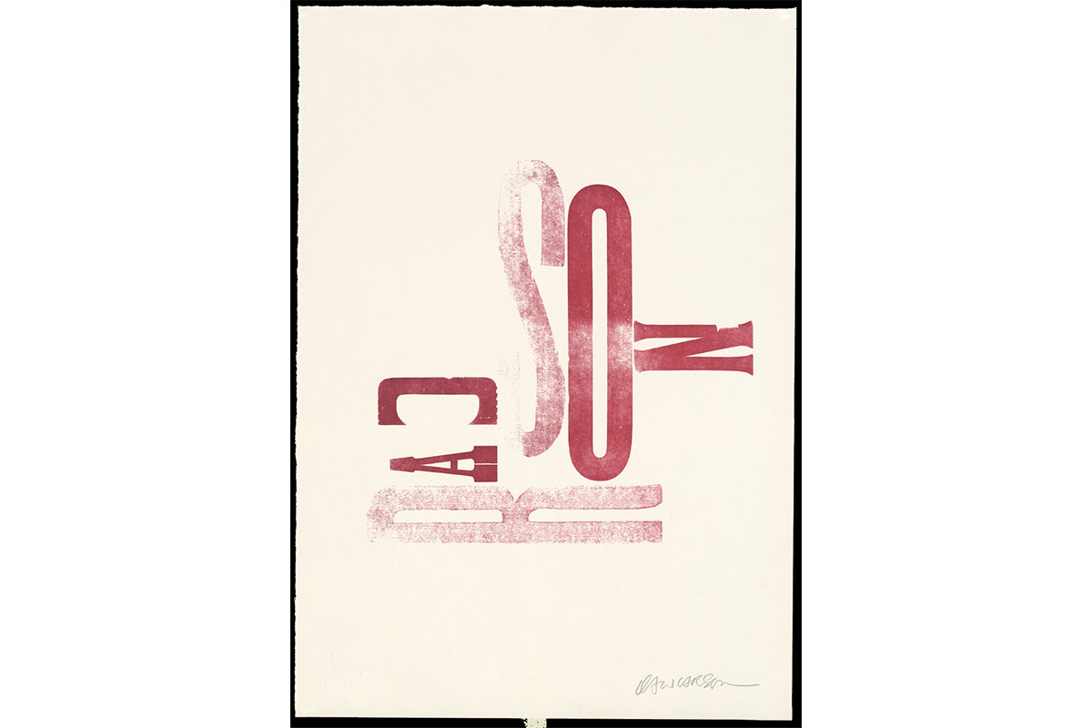
What followed was a series of projects for magazines within board sports and the grunge music genre that cemented David Carson’s distinctive style that can be best summed up with this quote:
“Don’t mistake legibility for communication.”
Carson’s pioneering style, although considered gauche and obnoxious to some, would go on to drive his agency to the height of its design power, allowing him to establish his name and studio in New York and work for some of the biggest names of the time.
At this point we could end the biographic timeline of David Carson’s work; a man who rose out of the 70’s California surf scene to global graphic design stardom, a surfing kid come good. But that wouldn’t quite be telling the whole story. Reading and listening to interviews with Carson spread across the internet you will hear a slightly different story.
In an interview with Matt Warshaw of the Encyclopaedia of Surfing, Carson recounts some of the stories of his often-short lived creative runs. His tenure at Beach Culture, an offshoot of Surfer magazine in the late 80’s, ran for only 6 editions whilst his post at Surfer ran for a slightly longer 2 years and 25 issues.

David Carson describes himself as a “difficult hire” in the interview. Maybe that’s not surprising for someone who considers the legibility of a magazine a worthy sacrifice in the name of art. Another quote from the interview may give some further idea of why his creative posts were not always the most long lived:
“I’ve never thought of myself as having a strong work ethic. I’m not organised or particularly good at deadlines.”
To look back through surf media of the past is an education that many young surfers of today may never realise. Surfers in the second half of the 20th century had their pick of multiple magazines, with bold ideas, photography, and containing information that kept them up to date with the cutting edge of the sport. Some of David’s covers were some of the most well received of the time and Matt Warshaw recounts his influence:
“When I come across the issues that I worked on in 1989 and 1990, my eyelids droop and sighs come one after the other, I give a quick word of quiet thanks that David Carson came along and zipped things back into life.”
All of this however remains a history of David Carson, a perhaps maverick art director who influenced board sports more generally. Having marinaded in the glorious days of the second half of the 20th century in California, he went on to bring the radical nature of board sports to design and media more generally.
It’s quite a story, but that is not all there is to say. DC’s influence and work spans well into the 21st century with guest publications of Tracks magazine and The Surfer’s Path. He was inducted into the East Coast Surfing Hall of Fame in 2014, and named by complex.com as #18 in their 30 most influential designers of all time. In a feature story in Newsweek, it was stated that Carson “Changed the public face of graphic design”. He is also considered to be the “most googled” graphic designer ever.

Although those accolades sound significant, they still somehow fail to communicate the scale of Carson’s influence on the visual medium. ‘Most googled’ tells you something, however you could still argue, how many people are really googling graphic designers?
If you remain unconvinced by the scale of Mr Carson’s influence, then in we would point you to Apple listing him as one of the most influential users of the Macintosh computer in 2014. There can be few who higher accolades in design thinking than one from Apple who have both facilitated and defined design for the better part of 5 decades.
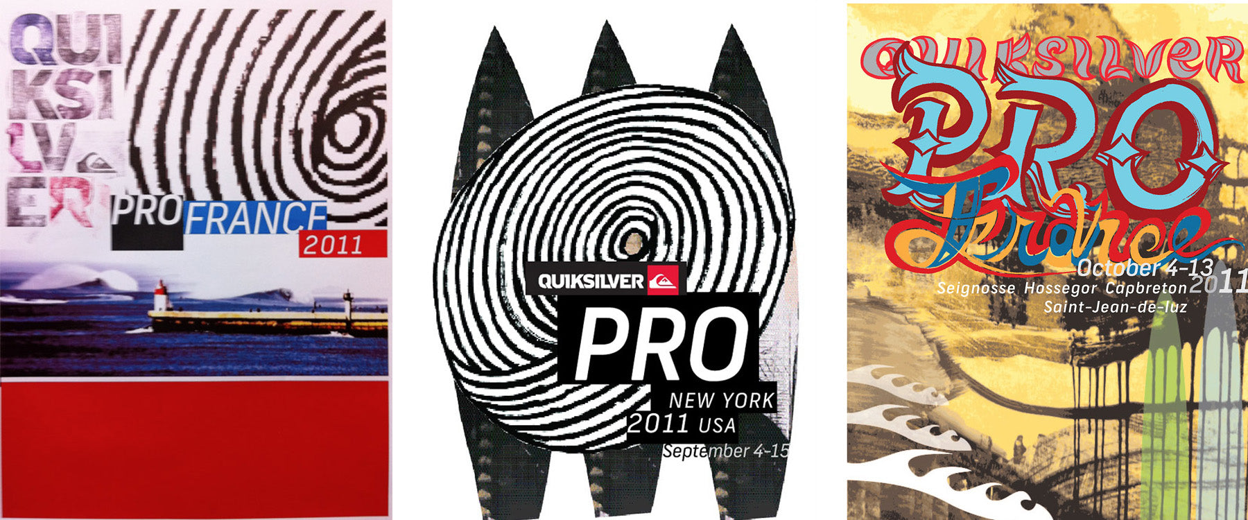
With that in mind we thought it would be worth referring to Ross Imms at A-Side-Studio - the man who worked with David on C-Skins’ 2018 rebrand - to get his take on working with a legend.

What was it like to work with such a legend in your field? Carson has a reputation for pushing his clients!
Each project we undertake has its own starting point. This one began as we were handed a thick deck of sketched logos by graphic design demi-god David Carson. I first came across DC’s work in the mid-80’s when he was designing Transworld Skateboarding Magazine - in fact, his ground-breaking layouts were the reason I took the graphic design path, so working with his concepts was a significant moment. We carefully considered David’s ideas, seeking the balance between raw artistry and commercial potential. Once we’d found the magic mark, we built a graphic language around the principles it set out, bringing a touch of post-modern nihilism to disrupt a sober industry.

How do you understand surfing's relationship with graphic design? Have you got favourite eras or moments from the past and where do you see it going in the future?
Surfing has a rich visual culture and DC has been a significant part of this. Surf decals from the 50’s – early 80’s was mostly simple, preppy, type-based decals, often accompanied by generic wave imagery. Retrospectively this pre-digital approach has a lot of charm, but it wasn’t necessarily a progressive visual movement. The early surf press was also conservative, with rigid layouts and mainstream imagery. When DC took the role of Art Director at Surfer Magazine, he broke free of the grid and got expressive with typography and image treatment. This post-modern approach was more aligned with surfing’s counter cultural ideals and helped bring surf culture closer to its younger siblings, skateboarding and snowboarding. Surfing is now huge and can be enjoyed by anyone with access to the ocean; it’s an Olympic sport with big industry sponsorship, but no matter how big the culture becomes there will always be an underground group of creative mavericks finding inspiration in the simple act of riding waves, and subconsciously turning this into a design aesthetic which will eventually filter into the mainstream. The time is always now.
You can read more about the rebrand by following this link to Stab's comment back in 2018 - How To Design Your Way Out Of Mediocrity

Carson is still firing in all cylinders, now living between California, Zurich, and the British Virgin Islands. He maintains his work and keeps his fingers in surf culture whilst living the life of an icon who has transcended the board sports community he was raised in.
Carson’s legend lives on and we are proud to have worked with him at C-Skins and look forward to seeing how he will continue to influence into the future.
